Matplotlib Plotting#
see also:
https://matplotlib.org/stable/users/explain/quick_start.html
https://matplotlib.org/stable/gallery/index.html (start here for inspiration)
# use matplotlib for plotting
import matplotlib.pylab as plt

import numpy as np
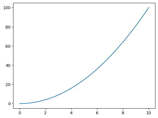
Simple Lines#
# create some test data
x = np.linspace(0, 10, 120)
y = x**2.0
plt.figure(1)

plt.plot( x, y )

plt.show()
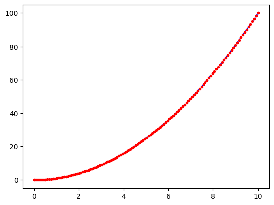
Line Styles & Viewing Modes#
plt.figure(1)

# as blue lines
#plt.plot(x, y,
#         color='tab:blue',
#         linestyle='-')

# ... or shorter
plt.plot(x, y, 'b--')

# as red dots
plt.plot(x, y, 'r.')

plt.show()
Error Bars#
# load data including errors
x, y, errors = np.loadtxt('./data/03_xyerr.dat').transpose()

plt.figure(1)

plt.errorbar(x, y, errors, fmt='ro')
# Note: Here we need to use "fmt = ..."

plt.plot(x, y, 'b-')

plt.show()
---------------------------------------------------------------------------
FileNotFoundError                         Traceback (most recent call last)
Cell In[5], line 2
      1 # load data including errors
----> 2 x, y, errors = np.loadtxt('./data/03_xyerr.dat').transpose()
      4 plt.figure(1)
      6 plt.errorbar(x, y, errors, fmt='ro')

File /usr/local/lib/python3.14/site-packages/numpy/lib/_npyio_impl.py:1397, in loadtxt(fname, dtype, comments, delimiter, converters, skiprows, usecols, unpack, ndmin, encoding, max_rows, quotechar, like)
   1394 if isinstance(delimiter, bytes):
   1395     delimiter = delimiter.decode('latin1')
-> 1397 arr = _read(fname, dtype=dtype, comment=comment, delimiter=delimiter,
   1398             converters=converters, skiplines=skiprows, usecols=usecols,
   1399             unpack=unpack, ndmin=ndmin, encoding=encoding,
   1400             max_rows=max_rows, quote=quotechar)
   1402 return arr

File /usr/local/lib/python3.14/site-packages/numpy/lib/_npyio_impl.py:1024, in _read(fname, delimiter, comment, quote, imaginary_unit, usecols, skiplines, max_rows, converters, ndmin, unpack, dtype, encoding)
   1022     fname = os.fspath(fname)
   1023 if isinstance(fname, str):
-> 1024     fh = np.lib._datasource.open(fname, 'rt', encoding=encoding)
   1025     if encoding is None:
   1026         encoding = getattr(fh, 'encoding', 'latin1')

File /usr/local/lib/python3.14/site-packages/numpy/lib/_datasource.py:192, in open(path, mode, destpath, encoding, newline)
    155 """
    156 Open `path` with `mode` and return the file object.
    157
   (...)    188
    189 """
    191 ds = DataSource(destpath)
--> 192 return ds.open(path, mode, encoding=encoding, newline=newline)

File /usr/local/lib/python3.14/site-packages/numpy/lib/_datasource.py:529, in DataSource.open(self, path, mode, encoding, newline)
    526     return _file_openers[ext](found, mode=mode,
    527                               encoding=encoding, newline=newline)
    528 else:
--> 529     raise FileNotFoundError(f"{path} not found.")

FileNotFoundError: ./data/03_xyerr.dat not found.
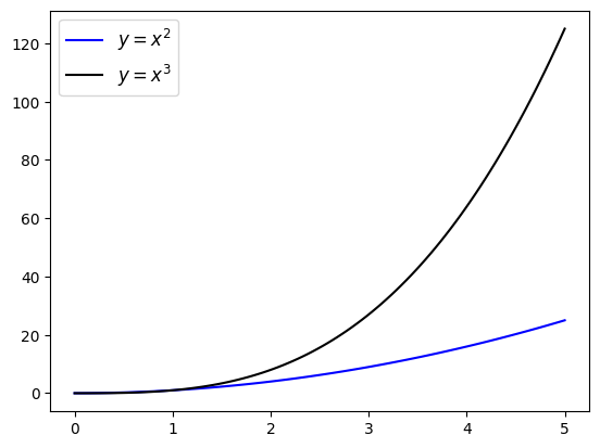
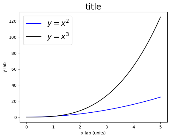
Legends & Labels#
# generate some data
x  = np.linspace(0, 5, 100)
y2 = x**2.0
y3 = x**3.0

# plot data
plt.figure(1)

#plt.plot(x, y2, color='b', label="y = x**2")
#plt.plot(x, y3, color='k', label="y = x**3")

plt.plot(x, y2, color='b', label="$y = x^2$")
plt.plot(x, y3, color='k', label="$y = x^3$")

# add legend
plt.legend(loc=2, fontsize=18)

# and x/y labels
plt.xlabel('x lab (units)')
plt.ylabel('y lab')

# don't forget about the title
plt.title('title', fontsize=20)

plt.show()
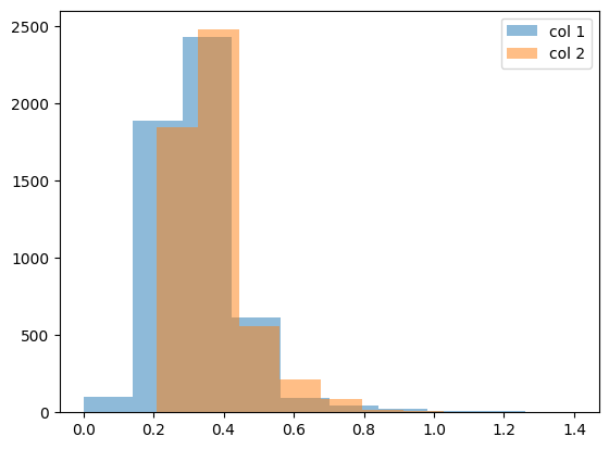
Histograms#
# load some data
myCol1, myCol2 = np.genfromtxt('./data/01_xy.dat').transpose()

plt.figure(1)

# let's get some idea of our data by plotting a simple histogram
plt.hist(myCol1,
         label='col 1',
         alpha=0.5)

plt.hist(myCol2,
         label='col 2',
         alpha=0.5)

plt.legend()

plt.show()
Example: Velocity of light as measured by Michelson#
Michelson:
first American to win a Nobel prize (1907)
disprove the existence of aether
measurement of speed of light:
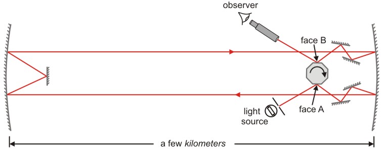
https://www.saburchill.com/physics/chapters3/0007.html
the time (\(t\)) taken for the light to cover the distance \(s\): $\( t = \frac{1}{8n} \)$
speed of light \(c\): $\( c = \frac{s}{t} = 8 n s \)$
# load data
dataMichelson = np.genfromtxt('./data/02_michelson.dat',
                              skip_header=1)
# plot data
plt.figure(1)

plt.hist(dataMichelson, bins=15)

plt.xlabel('$v - 299.000$ (km/s)')
plt.ylabel('N')

plt.show()
# plot data
plt.figure(1)

# get some statistical data
median  = np.median(dataMichelson)
average = np.average(dataMichelson)

plt.hist(dataMichelson, bins=15, label='Michelson ')
plt.plot([792.458, 792.458], [0., 18.], label='SI')

plt.plot([median, median], [0., 18.], label='median')
plt.plot([average, average], [0., 18.], label='average')

plt.xlabel('$v - 299.000$ (km/s)')
plt.ylabel('N')

plt.legend()

plt.show()

print(average, median)
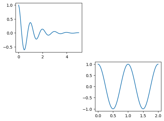
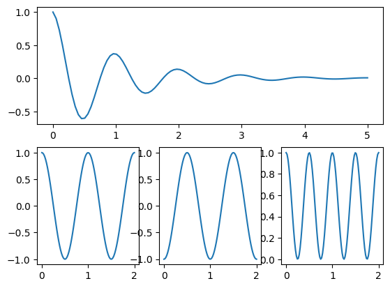
Subplots#
# create some data first
x1 = np.linspace(0.0, 5.0, 100)
x2 = np.linspace(0.0, 2.0, 100)

y1 = np.cos(2 * np.pi * x1) * np.exp(-x1)
y2 = np.cos(2 * np.pi * x2)
Simple version via plt.subplot():#
plt.figure(1)

# use subplot #1 out of a 1x2 grid
plt.subplot(2, 2, 1)

plt.plot(x1, y1)

# use subplot #2 out of a 1x2 grid
plt.subplot(2, 2, 4)

plt.plot(x2, y2)

plt.show()
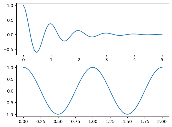
More sophisticated version using plt.GridSpec():#
plt.figure(1)

# create a 2x1 axis grid
grid = plt.GridSpec(nrows=2, ncols=1)

# use first axis
plt.subplot( grid[0] )
plt.plot(x1, y1)

# uses second axis
plt.subplot( grid[1] )
plt.plot(x2, y2)

plt.show()
plt.figure(1)

# create a 2x3 axis grid
grid = plt.GridSpec(nrows=2, ncols=3)

# use complete first grid row
plt.subplot( grid[0, 0:3] )
plt.plot(x1, y1)

# use first position in second row
plt.subplot(grid[1, 0])
plt.plot(x2, y2)

# use second position in second row
plt.subplot(grid[1, 1])
plt.plot(x2, -y2)

# use third position in second row
plt.subplot(grid[1, 2])
plt.plot(x2, y2**2.0)

plt.show()
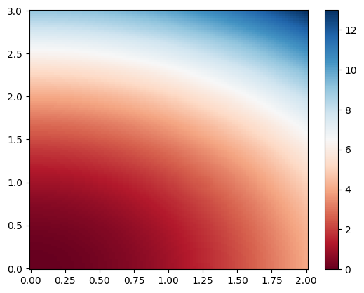
3D Plots / Colormaps#
self-defined z(x,y) data:#
import matplotlib.pylab as plt

# define x and y ranges
x = np.linspace(0, 2, 100)
y = np.linspace(0, 3, 120)

# create a x/y meshgrid
xGrid, yGrid = np.meshgrid(x, y)

# calculate some z(x,y) data from the meshgrid
z = xGrid**2 + yGrid**2

# plot it as a colormap
plt.figure(1)

plt.pcolor(x, y, z,
           cmap='RdBu',
           vmin=z.min(),
           vmax=z.max())

plt.colorbar()

plt.show()
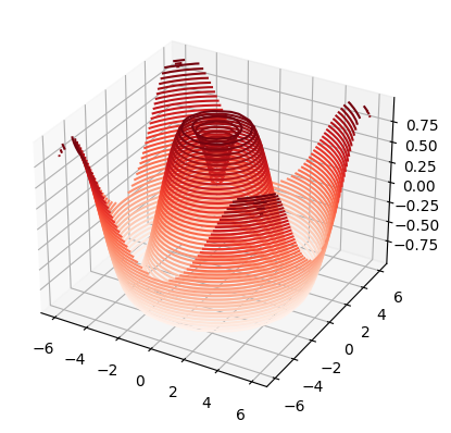
# use 3D axis
from mpl_toolkits.mplot3d import axes3d, Axes3D

# define some z(x,y) data
def f(x, y):
    return np.sin(np.sqrt(x**2 + y**2))

x = np.linspace(-6, 6, 30)
y = np.linspace(-6, 6, 30)

xGrid, yGrid = np.meshgrid(x, y)
z = f(xGrid, yGrid)

# plot it in 3D projection
plt.figure(1)

ax = plt.axes(projection='3d')

ax.contour3D(xGrid, yGrid, z,    # Note: here we need to use xGrid & yGrid !!!
             levels=40,
             cmap='Reds')

plt.show()
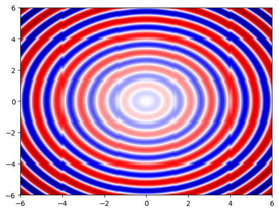
plot z(x,y) from xyz files using interpolation:#
# we use Scipy's griddata function to interpolate 3D datafrom scipy.interpolate import griddata
from scipy.interpolate import griddata

# load xyz data
x, y, z = np.genfromtxt('./data/04_xyz.dat', unpack=True)

# define new x/y grids including corresponding meshgrid
xNew = np.linspace(-6, 6, 100)
yNew = np.linspace(-6, 6, 100)
xGrid, yGrid = np.meshgrid(xNew, yNew)

# and interpolate raw z(x,y) to zNew(xNew,yNew)
zNew = griddata((x, y), z,
                (xGrid, yGrid),
                method='nearest')

# plot color map
plt.figure(1)

plt.contourf(xGrid, yGrid, zNew,
             levels=100,
             cmap='seismic')

#plt.axis('equal')

plt.show()
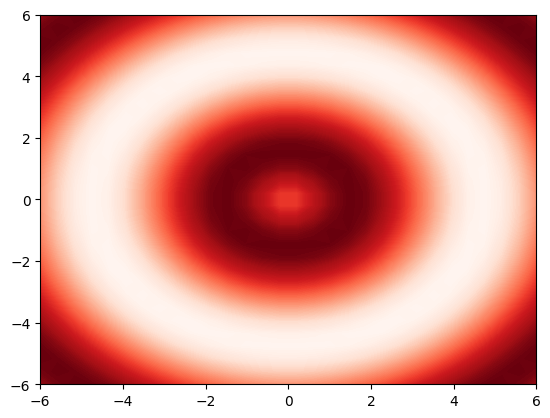
Saving Figures#
# define some z(x,y) data
def f(x, y):
    return np.sin(np.sqrt(x ** 2 + y ** 2))

x = np.linspace(-6, 6, 30)
y = np.linspace(-6, 6, 30)

xGrid, yGrid = np.meshgrid(x, y)
z = f(xGrid, yGrid)

# plot it in 3D projection
plt.figure(1)

plt.contourf(xGrid, yGrid, z,
             levels=100,
             cmap="Reds")

# save as *.png
plt.savefig('./data/test/02_colormap.png', dpi=60)
plt.figure(1)

x  = np.linspace(0, 5, 100)
plt.plot(x, x**2.0, color = 'b', label = "$y = x^2$")
plt.plot(x, x**3.0, color = 'k', label = "$y = x^3$")

plt.legend( loc = 2, fontsize = 12 )

plt.savefig('./data/test/03_1D.pdf')